March 23, 2023
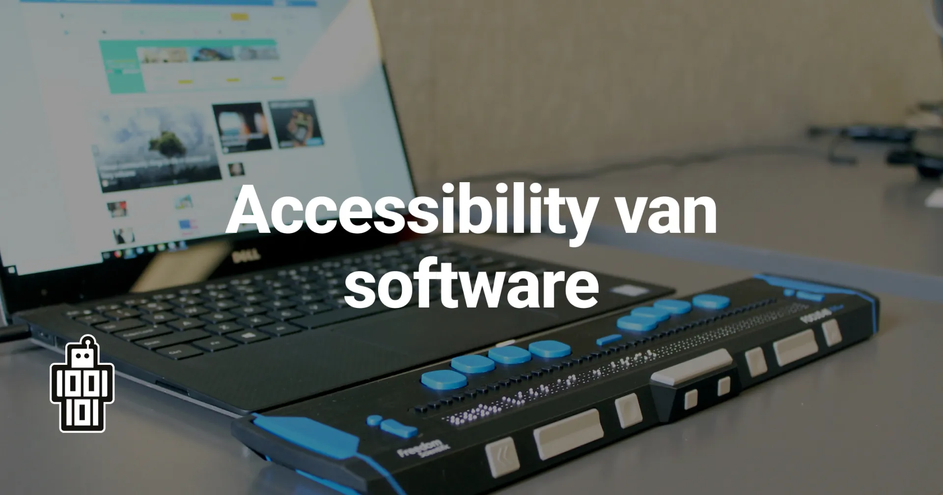
In the beginning of January we were approached by APPT with a report of the accessibility of the OmgevingsAlert App. This put us to work and triggered us to give the topic a look. Are our apps accessibly for a broad audience? Is everything clearly readable? Can the apps be used with technical devices like screen readers? And above all, how can we apply this in our products and projects?
In June 2019 the European Accessibility Act (EAA) was approved by the European Union. This law should make sure that applications and websites used in the European Union are satisfy set guidelines for accessibility. This guidelines are described in the Web Content Accessibility Guidelines (WCAG). Government websites and apps should meet level A and AA to make sure these are accessible for as many Europeans as possible. The law will be enforced from 2025 onwards, in 2022 all European countries should have incorporated the act in their national laws.
To meet these requirements, certain guidelines have been established, some of them are even very easy to test. For visual, these include, for example, a subtitle and description of a video, clear instructions for fields to be filled in and whether the content is rotatable. For text, these requirements focus on text magnification and visibility, is the text scalable and does it not fall away with other content? In addition, contrast is important for visually impaired and colour-blind users. Thus, text should have a contrast of at least 4.5:1 in relation to the background colour, and contrast of content (icons, buttons and graphical elements) and bold and larger text should comply with 3:1. Finally, the application should be operable with a screen reader for visually impaired and sightless users. This requires considering alternative text, information and relationships of graphics and text, meaningful order, headings, labels and ensuring that these users do not get stuck in the application.
Our designer, Texas, went to work for the OmgevingsAlert App and ensured that the report was incorporated into an update for the app. The findings were thus aligned with the app's identity and design. This also found useful skills and tools that we can use for other projects and products. Such as the Figma plug-in 'Axe for Designers'. This plug-in can automatically scan designs in Figma's sketchbook for accessibility and suggest how to improve it. Every design will be scanned by this from now on to ensure that our products are accessible to as many people as possible.
After the design is finished, our developers get to work. They have received training in accessibility at APPT and so they can apply this to the best of their ability in developing the apps. Their main task is adding colours and contrast, and properly arranging labels to elements. When elements have the right label, screen readers can process them properly and applications are usable even by users without vision or with very poor vision. By having applied this immediately in the OmgevingsAlert App, they are experienced in this and it can be included immediately in future updates.
Do you also want a platform or app that is accessible to as many people as possible? Get in touch with us at info@9to.software.
Do you want to help us make sure our apps and platforms are accessible to as many people as possible? Then take a look at our job openings.


