Keeping the Netherlands informed about NL-Alerts

Client and context


Functionalities


What has been developed?
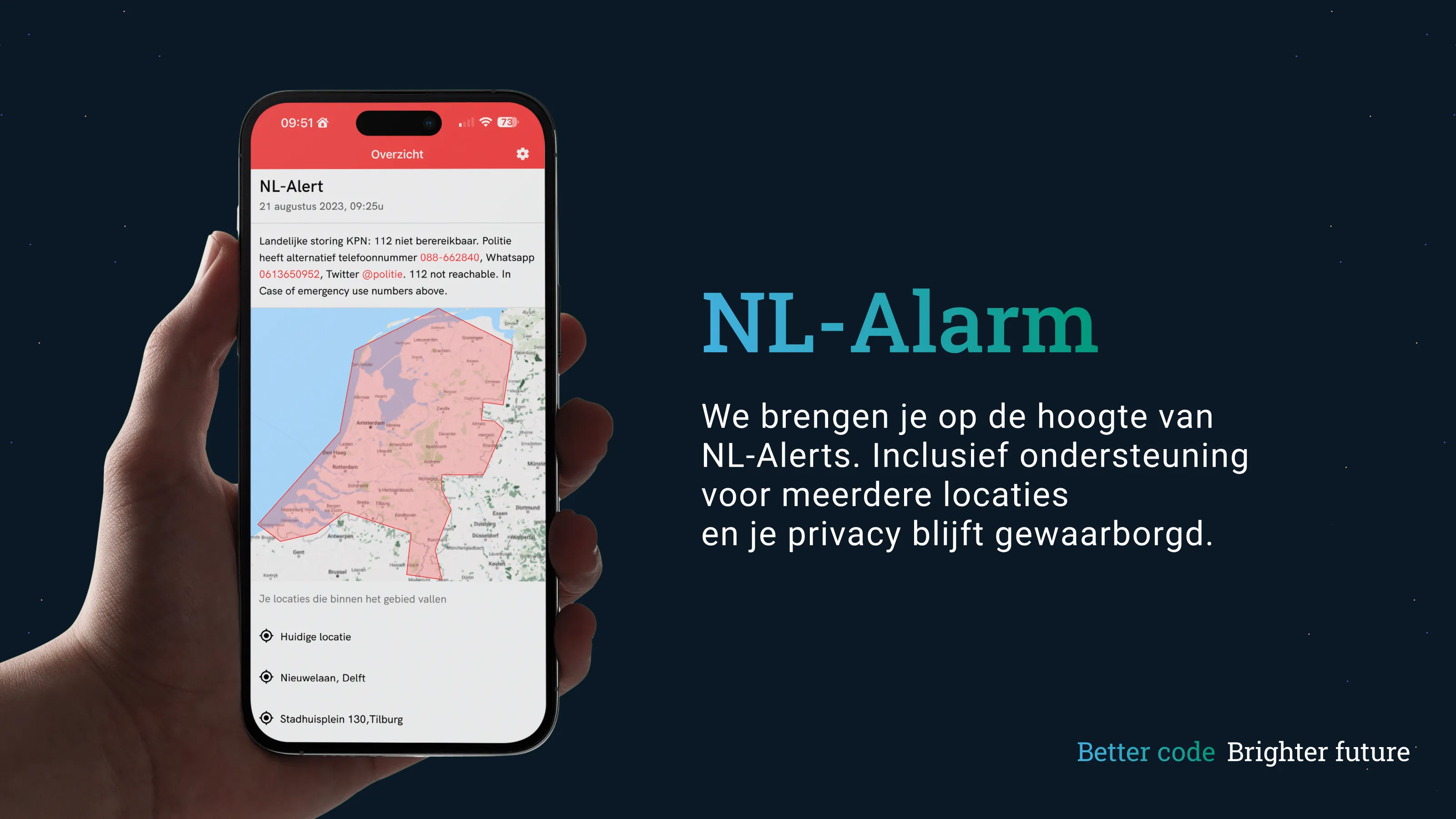
The NL-Alert system is useful because of its simplicity. Only users that are connected to a specific cell tower receive the message, which allows for direct and specific targeting. This however, has its downsides in areas that lie on a border between two transmission areas and when a user is not connected to their local cell tower. This app is aimed at providing a solution for these kinds of situations.
To safeguard the privacy of users the choice was made to keep location data on the user's device. The app receives an emergency broadcast and decides whether this is relevant to the user. When such a broadcast is relevant a notification is sent to the user.
This app provided an interesting case for our backend developers. Usually only a few users will be active in the app, which means that the server only needs limited capacity. However, a massive spike in use will occur when an NL-Alert has been sent out. This means that the server has to be able to be able to scale up quickly to meet demand. Google Firebase hosting and cloud functions are used to handle these scenarios. These platforms are designed specifically for these kinds of situations.
The NL-Alert logo is based on a bottom view of an air raid siren. In the year 2020 we want to replace these sirens with the NL-Alert app. By using the air raid siren as a logo we'd like to pay tribute to this recognizable and historic object. The logo allows users to instantly recognize the app as the place to receive critical information about calamities in their vicinity. The soft red used in the logo allows for a informative instead of a distressing impression. To make the app usable by everyone a readable and accessible font is used. This allows for important information to be communicated as efficiently as possible.
Because information displayed in the app is often critical, it has to be clear and visible as soon as the user opens the app. This is why all critical information is shown to the user as soon as the app is opened.
For the website we wanted a page that was as clean and clear as possible. A short summary of our system tells the user what the app does and why the app is unique. We want to be transparent about why the app was built, which user data we save and what we do with this data. In this project privacy comes first. The privacy policy and press release are the only two other pages next to the home page.


